Dashboard
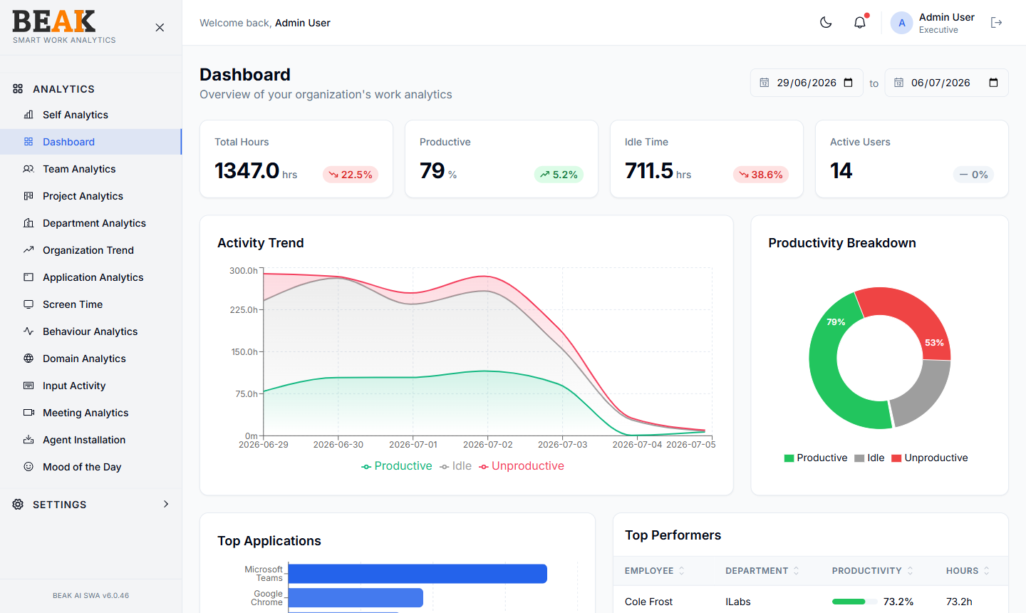
The Dashboard is the executive landing page for BEAK SWA. It rolls up activity from every device under the tenant into a single overview — four KPI tiles, an activity trend chart, a productivity donut, top applications, and a top-performers leaderboard.
Date Range
The date range picker in the top right scopes every chart on the page. Default is the last 7 days. Comparison percentages on the KPI tiles (e.g. ↘ 41.2%) are measured against the previous matching period of equal length.
KPI Tiles
The header strip surfaces four organization-level metrics:
- Total Hours — Total recorded screen time across all active users in the period
- Productive % —
Productive Hours / (Productive + Unproductive Hours)— idle is excluded - Idle Time — Total time spent at locked screens or below the idle threshold
- Active Users — Distinct users with at least one minute of captured activity in the period
Each tile shows a delta indicator vs the previous period — green ↗ for improvement, red ↘ for decline.
Activity Trend
A daily line chart that overlays three series for the selected window:
- Productive (green) — Hours classified as productive
- Idle (yellow) — Hours classified as idle
- Unproductive (red) — Hours classified as unproductive
Hover over any data point to see the exact hour count for that day. Use this chart to spot weekly patterns — e.g. lower productivity on Mondays or unproductive spikes in the afternoon.
Productivity Breakdown
A donut chart showing the share of time across the three productivity buckets for the period. Inner labels show the productive % at the center; outer percentages show the share of each bucket against the total.
Top Applications
A horizontal bar chart ranking the most-used applications across the organization for the selected window. The bar length represents total hours; the bar color is consistent across SWA charts to make applications easy to recognize across views.
Top Performers
A sortable table ranking employees by productivity for the selected window. Columns:
| Column | Description |
|---|---|
| Employee | Full name and avatar |
| Department | Department from the user record |
| Productivity | Productive % with a horizontal bar gauge |
| Hours | Total productive hours |
Pagination controls (First, Prev, Next, Last) let executives browse beyond the top 10. Click any column header to sort.
Best Practices
- Use the dashboard as the daily standing review for delivery heads and HR — it answers "are we trending up or down" in one screen.
- If
Active Usersdrops sharply, check Agent Installation for devices that have gone inactive. - Pair the
Productive %tile with Behaviour Analytics to investigate root causes for sustained dips. - The
Top Performerstable is most useful at the team level — apply department or project filters in the dedicated views (Team Analytics, Project Analytics) to avoid global-rank noise.
Related Pages
- Team Analytics — Team-level rollup with member breakdown
- Application Analytics — Detailed application usage
- Behaviour Analytics — Login and overtime patterns
- Organization Trend — Multi-month trend analysis