WiFi Monitor & Heat Map
WiFi Monitor
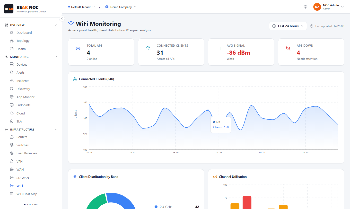
Summary Cards
| Card | Description |
|---|---|
| Total APs | Count of access points under monitoring, with online count shown |
| Connected Clients | Total wireless clients connected across all APs |
| Avg Signal | Average received signal strength across all connected clients in dBm |
| APs Down | Count of access points that are offline or unreachable |
Connected Clients (24h)
A time-series line chart showing the total number of connected wireless clients over the last 24 hours.
Client Distribution by Band
A breakdown of connected clients by radio band (2.4 GHz, 5 GHz).
Channel Utilization
A bar chart showing utilization percentage for each channel in use across your AP fleet.
WiFi Heat Map
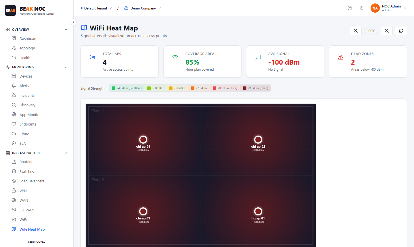
The WiFi Heat Map overlays signal strength data from your access points onto a floor plan image, giving a visual representation of RF coverage across your physical space.
Summary Cards
| Card | Description |
|---|---|
| APs | Count of access points shown on the map |
| Coverage Area | Percentage of the floor plan with signal coverage |
| Avg Signal | Average signal strength across the coverage area in dBm |
| Dead Spots | Areas with no detectable signal |
Reading the Heat Map
Signal strength is rendered as a colour gradient from strong (green) to weak (red). Access points are shown as labelled icons on the floor plan at their physical locations.
Related Pages
- Devices — Access points appear in the device inventory
- IPAM — WiFi subnets tracked in IP address management
- VLANs — Wireless VLANs monitored in VLAN traffic view
- Network Health — AP availability contributes to overall network health score